Showing posts with label Discourse. Show all posts
Wednesday, 18 April 2012
Alexander Rodchenko
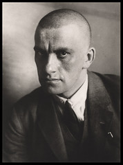
Russian born graphic designer, artist, sculptor and photographer. His aesthetic is extremely bold, arranging big blocks of colour and slabs of black into dramatic shapes. He is well known for his poster work such as his “Knigi” window poster from 1925 (p18, Elliot, 1979), though his work was allot more varied than just poster designs. As one of the founders of constructivism, his work spans many mediums. From painting and sculpting abstract geometric shapes to photo-montage with incorporated typography. Though I don't personally like his sculpture, it was clearly influenced by his contemporaries like Naum Gabo and Tatlin, and they frankly do it better. His painting in the same vain as his sculpture however, is interesting. His drawing encapsulates so much energy in it's lines that I can't help but be drawn in (his tempera paintings from 1917 and the oil on wood compositions from 1920 for example).
What I'm a real fan of is his photomontage work from 1923 to 1927. The way the images and type fit together in these almost (if not actual) propaganda style posters create such bold imagery. Even with my limited ability to read russian (ie no ability), I find myself jumping from word to word trying to read them phonetically. The “Battleship Potemkin” poster (1925) uses symmetry and blocks of text to reflect the czarist themes or mechanical order within the film.
Elliot, David: Alexander Rodchenco (1979); published by MoMA Oxford.
Blade Runner
Just 7 years in the future now and we are far but in the world of Blade Runner. We don't have flying cars, monolith cities with sub cities and lower realms of putridity or even realistic/self aware human like robots. I mean what have we been doing for the last 30 years? Or is our world a lot more like the world of blade runner than we might first think? When I first saw blade runner, I like many others, didn't quite get it. I didn't understand what it meant or how to interpret exactly what was going on. Here was a detective that didn't do much detecting and barley spoke. When I revisited it a few years later, I understood the visual style of the film more clearly. That the message was in the streets and in the nuances of Harrison Ford.
Blade runner was now the story of a “derelict city, choked with pollution and populated by the dregs of humanity” (Wright, 1983). A dystopia of neon, smoke and rain. Sounds a lot like east London, Tokyo or New York. Blade runner wasn't the fantastical story of a glistening future like I was used to from sci-fi, it showed me the gritty truth of what cities now were like. Granted it was exaggerated for visual effect, so we don't have spinners (flying cars) to whisk us off to the Tyrell corporation for a brand new replicant snake but, it was a remarkably accurate portrayal of the near future.
Ridley seems to carry on a theme from his film Alien (Scott, 1979). The character Ash is an android under the control of “the company”. He's directed to take the alien back to the company for further testing with the crew set as expendable.
Bill Cunningham
Street fashion photographer for the New York Times. An old man living in an old building taking photo's way ahead of his time for most of the time. Truly an amazing man. His photographs have documented the New York style for half a century and are a class above many of his now competitors.
Bill splits his time between photographing charity dinner, fashion shows and his renowned street photography. When at fashion shows, he only raises his camera when he see's something he likes. For most of the show the camera is probably in his lap. If he's seen that outfit before, he doesn't bother. Even if it was 40 years ago he saw it and it's some reinvention (He's known for calling out designers on reusing outfits and styles; occasionally getting in trouble for pointing it out).
One curious feature of bill is his ability to slide into a crowd. A nameless face snapping pictures of passers by. Only when you know who he is does it become apparent why. His cheap blue jacket and almost free poncho both set him out from everyone else on the streets of paris during fashion week and blend him into the walls of New York.
Thursday, 29 March 2012
Pick me up 2012
Pick me up is an annual contemporary graphic arts fair held at somerset house (since 2010) that showcases the work of up and coming or popular graphic artists from the UK and overseas.
This being my second Pick me up, I knew what to expect and wasn't surprised by the walls of printed A2 work with the ocasional hand drawn piece dotted about the place. I was equally un-shocked by the possibility of making my very own silk screen t-shirt with a nicely drawn something or other on the front. These are things that happened last time. True, you don't get that at the Tate or the National Gallerie but it's not exactly ground breaking either. Maybe I'm being cynical and not revelling in the popularity of my field (graphic printmaking) like Amelia. She refers to the collection as "a fabulous preponderance of screen prints and risograph images", saying that these methods are beloved because digital imaging is so wide spread. Could print making even be comparable to impressionism as a response to photography? or has it reached the level of being kitch? The techniques used are often fairly old and the visual styles are the same as if they were digitally printed, so what makes them different from that? After all riso prints are basically richer colour digital prints.
I did have a strange feeling half way through the show when I realised I had seen a lot of the pieces before on websites like tumblr and ffffound. I'm not sure exactly how I feel about this. In one way it's a good thing as great work is shared around to people that can't make it to galleries every week. But then, when I go to a gallery I want to see something that I can't find on the internet. Or at least if you can find it, it hasn't got the same quality of image (texture of paint on canvas for example). When all the images are mechanical prints to start with, the digital or book prints aren't far enough away from the originals quality for the original to be worth visiting. The only saving graces are the prints that are done by hand like the few etchings and the single small room of hand pulled screen prints. I think I should just buy the books and not go to the shows in the future. I doubt the images will loose on feeling from being printed in a book and on the off chance that there is one piece that I feel I need to see in person, I can always pop in for it.
Monday, 5 March 2012
Jeremy Deller
Jeremy Dellers “Joy in People” at the Hayward Gallery feels very much like a retrospective. It embraces it hole heartedly and makes no apologies. You start off in his teenage bedroom with his paintings and photographs on the walls. Cuttings from newspapers and little things he's made (like post cards and beer mats) in cupboards in draws. There's even little toy stereoscopes with a skylight like a true 80's bedroom in an attic. The rest of the show continues in what I assume is the chronological order.
Some of his text and image pieces are quite interesting. Especially the screen printed posters for galleries and pop events. Deller felt the need to make more interesting posters than those already in use and stick them where they might not normally be placed. These prints have a distinct visual style compared to much of his other work. The colours for example are a lot bolder then anything else he's done (bar the clown at the worlds fair but I'm not sure that counts).
As strange as it is to say of a 3 minute video made in 2 days, “Exodus” is probably the best experience of 3D I have ever had. When I first heard of him making a 3D video of bats (on the culture show Feb 2012) I was sceptical as to if it would work and if the 3D would add anything special. I redact my scepticism. I can't imagine watching this in flat 2D. When the front plane is full of racing bats and you can look through them to see a swarm on the rear plane swirling and warping around the sky is quite simply magical.
Monday, 13 February 2012
we need a good push before we fight back
Have you been following the SOPA, PIPA and ACTA bills being passed in America and around the world?
Do you agree with them and the things they entail?
Did you do anything to stop them? did you take to the streets in the occupy campaign? or change your twitter or facebook image to an anti SOPA icon?
Didn't have to do that much and it stopped it!... right? but then 2 weeks later, pipa appeared. then acta. Didn't stop the people behind them did it?
Here's an article explaining why the passing of SOPA would be a good thing.
Basically, if they passed, people would get off their laptops and actually do something useful against it and the people behind it might change. who knows, could even spark a total revolution...
Thursday, 9 February 2012
Post modernism - All surface
Scratching the Surface - Alexandre Farto
Since the start of post modernism, surface and texture is just as, if not more important, than meaning. Pollocks splatter paintings for example are all about the look of fractals and the texture of paint. It's all about ideas and their interpretation between people.
This idea of all surface and no depth saturated society as a whole. I mean plastic surgery, las vegas, advertising and fashion are all post-modern in nature.
I've become bored of all this surface. I'm tired of fake. It's corrupted our minds so we think we should look post-modern and plastic ourselves when we're supposed to look hand made and crafted. we live in a world were the film face/off (1997) is more like a documentary than a thriller.
So what comes after post-modernism? A revert to the hand crafter and unique? unlikely. Maybe a push for community or an anonymous revolt.
I'm betting on the screen revolution, ultra-modernism. Everything is surface and flat when the screen shapes the world.
Minority report - 2002
Subscribe to:
Posts (Atom)